Best Sports Logo Of All-Time
I don't know about you, but I love old-school sports logos. Whether it's the old Orioles bird logo from the 80s or the Winnipeg Jets logo from the late 70s to the mid-90's, there's just something about cool-looking teamwear that make me smile.
But there's one team's logo in that's my favorite of all-time.
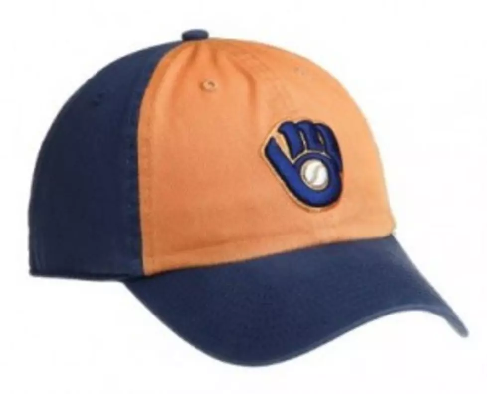
The best logo in sports is the old school Milwaukee Brewers logo. The Brew Crew, led by Robin Yount and Paul Molitor, wore these hats from 1978-93.
For those that can't figure it out, it's an "m" and "m" interlocked together to look like a baseball glove. Simply genious!
It's kind of like a great piece of artwork that you have to stare at for a few minutes to really see the hidden image. Some people see the logo integration quickly. While others like my producer, Alan Fish, didn't know what the logo was supposed to be until a few months ago. When he realized what it was, he said, "Wow, that's really cool."
And that's why I love the logo. It's artsy.
The logo is also so 1980’s. The Brewers hat has that 80’s feel to it. It’s so cheesy but so freakin’ cool. It also harkens back to my childhood which holds even more meaning. That’s why retro stuff is so cool today. It brings you back!
What makes a good team logo? Creativity, color coordination and implemention of the team’s logo to match the sport! The Brewers old school hat has all of that!
More From 104.5 THE TEAM